


Hi UX designers! I’m gonna tell you some tips that we always apply in our projects when we make the UX work. Here we go!
Show content immediately
Try to show the content in the first view, better if user don’t have to search or press any buttons to obtain it. In this way you facilitate the information, show the important content at the beginning and you motivate him/his to start the experience in your application.

Save steps to your users
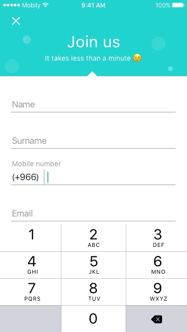
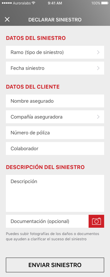
The user wants to get what he is looking for with not wasting time, less tabs to make, easier and better user experience in our app. A clear example would be a form. This is a component that is present in almost all application. For a good UX, design it with the minimum fields possible. If you have already the necessary data with three fields, do not demand five, the user will thank you.
If the action you expect is done in several steps, show with a clear and informative indicator in the app how the progress is going. Many times, users get frustrated when they think they have finished and suddenly more fields to fill came out. It’s annoying, don’t you think?

Careful with the keyboards! Try to facilitate the introduction of data to the user
Users value applications that offer a suitable keyboard for the required text entries. Ensure that this feature is implemented consistently in the whole app. Don’t obligate user to change the keyboard manually, it cost time. For example, if you ask in a field for the phone, show the numeric keypad, if you ask for the email, show the @ please!
Also, make sure that fields or buttons are always visible and not hidden below the keyboard. The confirmation button should always be above the keyboard or placing in the navigation bar.

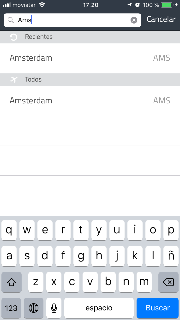
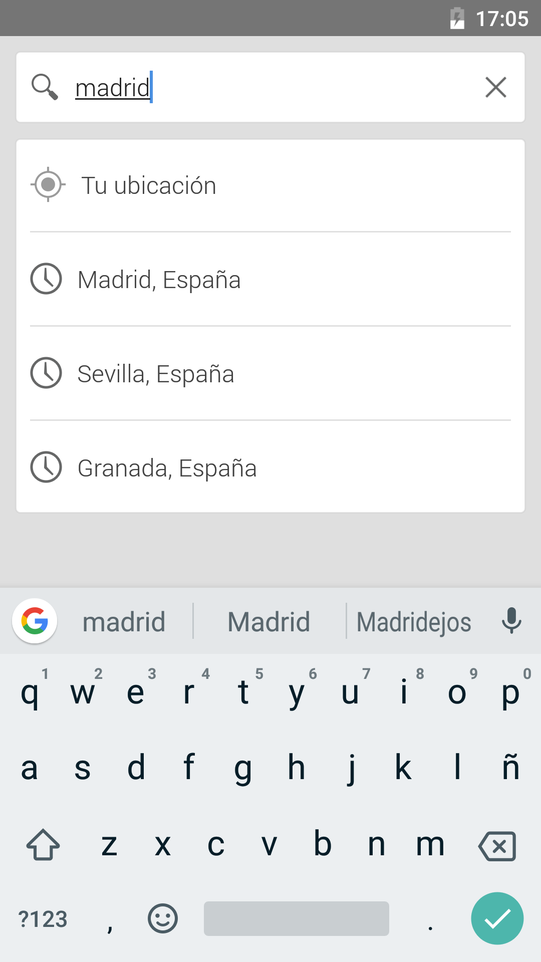
Help the user to precomplete the forms or searches for a better UX
The autocomplete function is very useful. For example, if we are looking for a city, when we are typing A-M-S, AMSTERDAM should come out as a suggestion. In any search engine you must implement the autocomplete functionality and show the most common search elements.
Do not force anyone to sign in your app. Instead, show the advantages of doing so
Users abandon applications that request personal information in advance unless they offer some kind of immediate reward for doing so. In particular, applications with a no brand recognition. Just ask a user to sign in if it is essential to do so. In addition, users will be grateful if they have the option to log in through Facebook, Google + or similar. This saves time introducing data, they prefer a couple of tabs with this method. See here more about the process of an onboarding in the app.

Icons with labels
Whenever you can, add the labels to its icons. In this way, it reduces confusion and allows users to stay focused on their task. Not always the icons are interpreted in the same way so we ensure a better UX if we reinforce the icon with its text or vice versa.

Hierarchize the information
Take time to think about priorities and organize a coherent structure, is a good UX tip. The elements of the upper part must always be the most important. In addition, the main actions must be differentiate from the secondaries, for example, the “confirm” and “delete” buttons. Another important tip for a good information structure, is the grouping of elements that have a similar functionality.

Create clean, clear and not overloaded screens
First of all, don’t be afraid to white spaces in the app, many times the blank helps enormously to the understanding of the application. Leave ample margins around texts and images, do not compress the screen as much as possible, let it breathe and you don’t fear the scroll.
Second, clear and bright applications are much more attractive to users nowadays. The aesthetics are changing very fast but the guidelines of the suppliers clearly recommend order in the components and also in the colours used in the interface. White and light colors used in backgrounds or in large areas inspire relax and comfy than dark or vibrant ones.
And finally, typography. Keep in mind that for a better UX, limiting yourself to use only two or three typographic families. In UI and UX less is more!

Always facilitate recent searches
To save time and effort to users, make available the previous searches or recent purchases. This is extremely important for users who frequently use the applications repeating searches or purchases. Also, it is a tip for inspire and motivate the user to purchase and also for us to fill space on the search screens.

Use the Touch ID to authenticate passwords whenever you can
As I said before, users do not like to fill a multi-step procedure to configurate something or reset a password. It simplifies the authentication experience and reduce the risk of abandonment. Minimize the number of steps required and use alternative authentication methods such as fingerprint recognition.
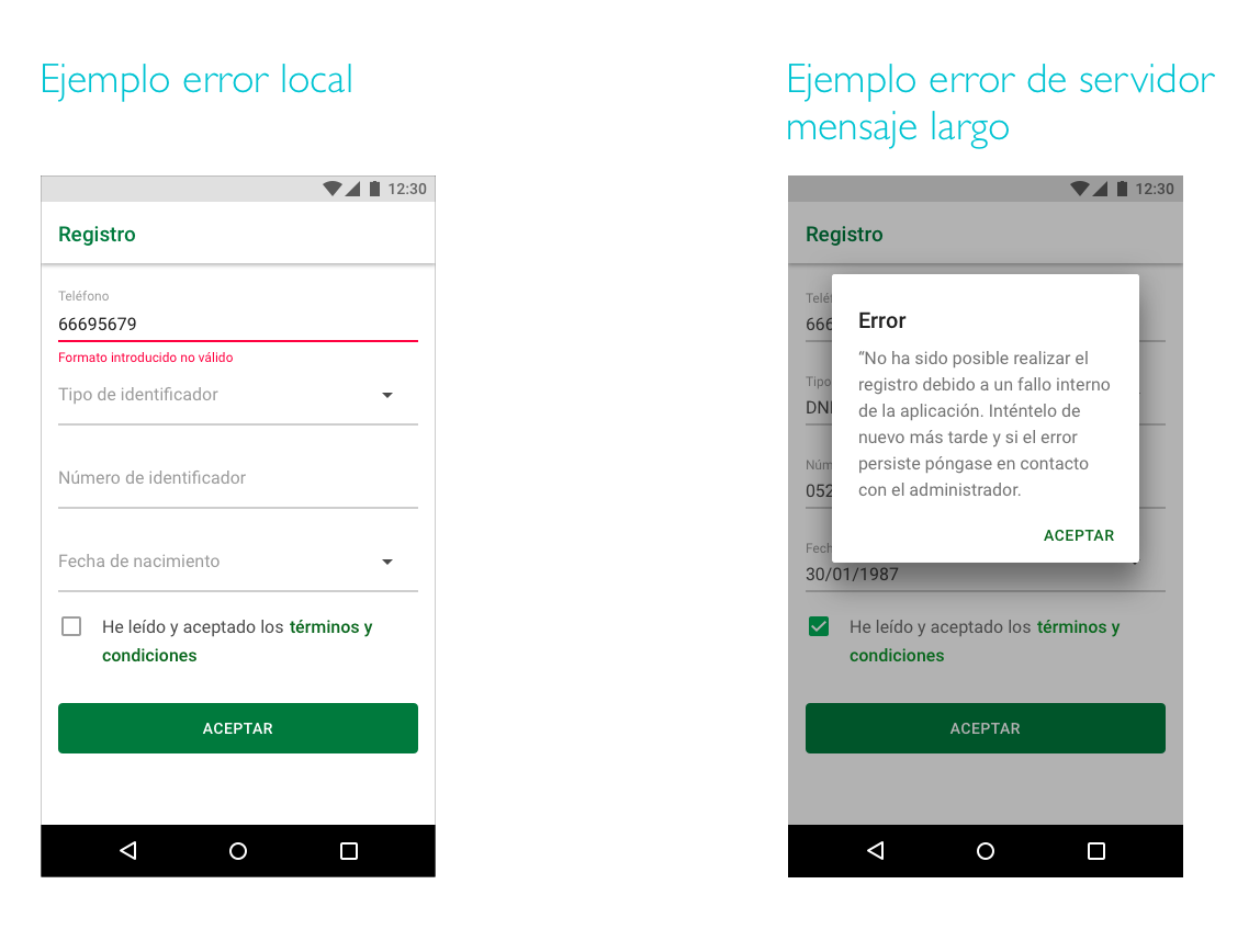
Always give feedback to the user when an action has been taken or not
Any action that has been asked to the user must be confirmed clearly and visually once it has been done. In the same way, any error that appears in the process must be clearly informed so the user can quickly understands what the problem is and how to solve it. These error messages must be different from those that are only confirmation.

Ask for allow permissions at the moment you really need them
It is recommended to not press or harass the user with permission requests immediately after opening the app for the first time. This is something negative and intrusive that can make the user leave quickly. In addition, they may be unable to advance with a task if they denied essential permissions at first. To solve this problem, we must request the permissions in context (just when it is necessary) and communicate the value offered. Users are more likely to allow permissions if they are requested during a relevant task than at the first time that they open the app.

Allow users to go backwards
During a form or task, users may want to go back just one step. Apps should always allow to this so users do not feel forced to start again from the beginning. If users are allowed to take a step back, this frustration is avoided.

I hope this post has been useful for you guys and you can apply it to you wonderful designs. I leave here another post about tools for UX/UI designers that maybe helps you too.
Cheers!