Fitts Law applied in UX
Have you updated your iPhone to iOS 16 and have you seen that notifications are now displayed at the bottom of the screen? Yes, this is what we are going to see today with Fitts Law applied in UX. Let’s first see what Fitts Law is.
What is Fitts Law?
It is a mathematical model made by the psychologist Paul Fitts in 1954. After a series of studies and experiments on psychomotricity, Fitts identified a relation between time needed to aim and reach a target and its size and distance. So, if the target is closer or larger is faster to reach it. This law today is perfectly applicable to the design of digital products.
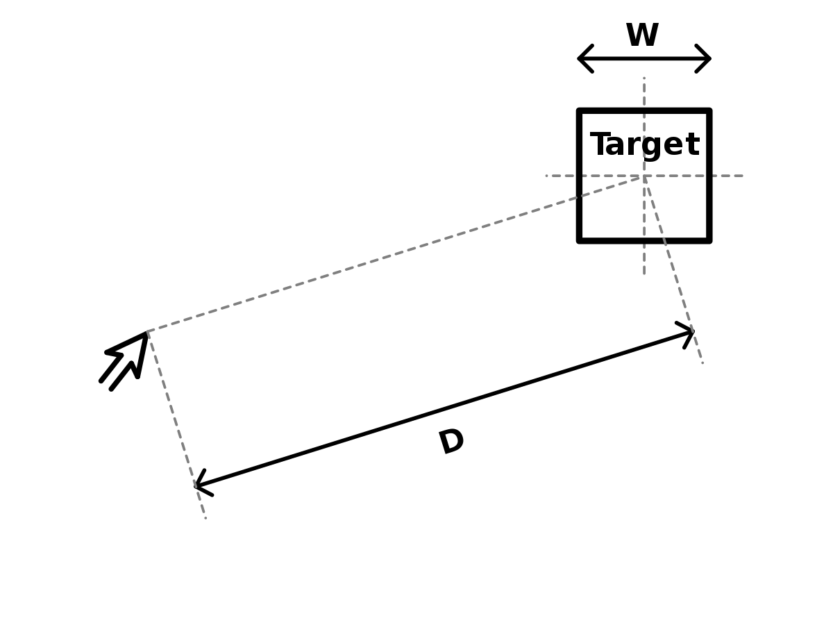
“Time required to hit a target with a fast move is a function of the size of the target and the distance to travel to it.”
Paul Fitts, 1954
And how do we apply this law in the UX of our apps?
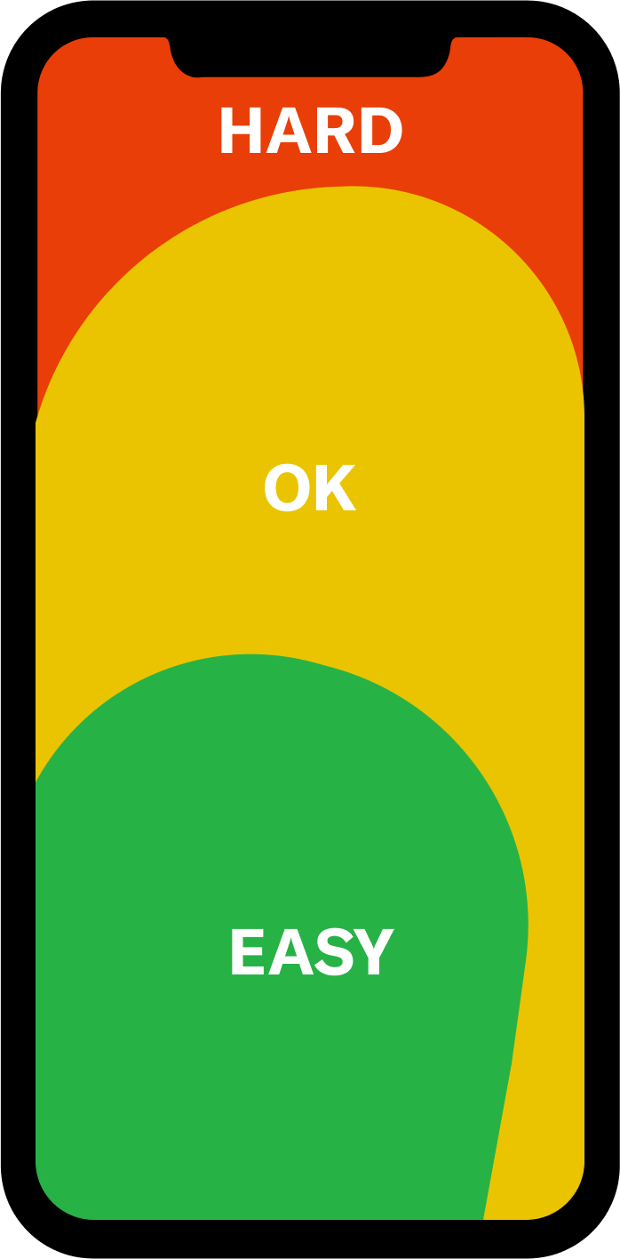
Designers apply this law in various ways:
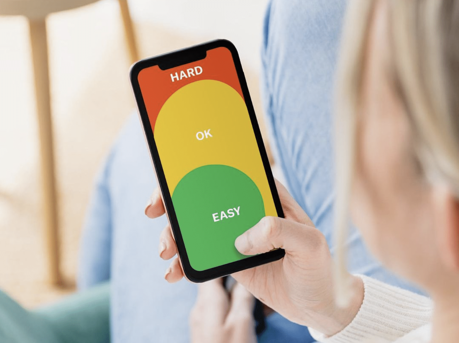
– The important actions or buttons will be positioned in a place where our thumb can comfortably access using only one hand. We can see in the above image the area where users can easily reaching with their thumb. Here we will place the lower menu to change of sections and the primary actions of the app such as like, favorite, comments, buy, register… etc.
– We will not make the forms too long because every time we have to reach something, the brain quickly calculates the goal and the distance to find the result of the speed and precision necessary for the task. In this example it would be to finish the form quickly and easily. Well, if this is so, our brain releases dopamine facilitating the repetition of the action. So it enables a direct increase in conversions. Therefore, the purchasing or contracting processes should be short, with few forms to fill out and little text to read.
– We will design the buttons with large sizes and quite striking. So in this way, user can recognize the main actionsand the work will be done intuitively and efficiently.
– We will structure the navigability with sense so user finds what he needs quickly. We will keep in mind for the design the user’s reading pattern and also the hierarchy of the elements so that they can intuit where they should go, according to what they need, without reading or becoming saturated. This translates into good usability and ergonomics.
And what does this have to do with the example of notifications at the bottom of the screen?
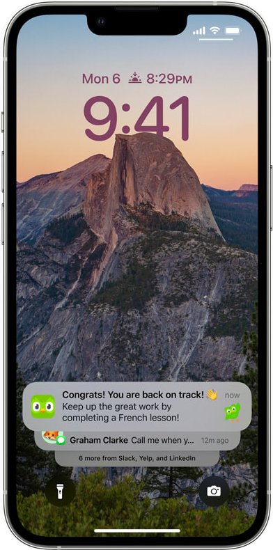
As we have mentioned before, in this latest iOS 16 update, notifications have been placed lower so that the user, holding the device with one hand, can reach to open them with his thumb. At the top of the screen, it forced the user to perform a more complicated gesture or even hold the mobile with two hands.
Conclusion
→It is essential to place the important actions in places where our thumb can reach, with large and striking buttons. Navigation should be easy and intuitive and the forms as short as possible.
If you liked this post, you will surely like this other one about UX tips to design your app. Thank you! Thank you!

