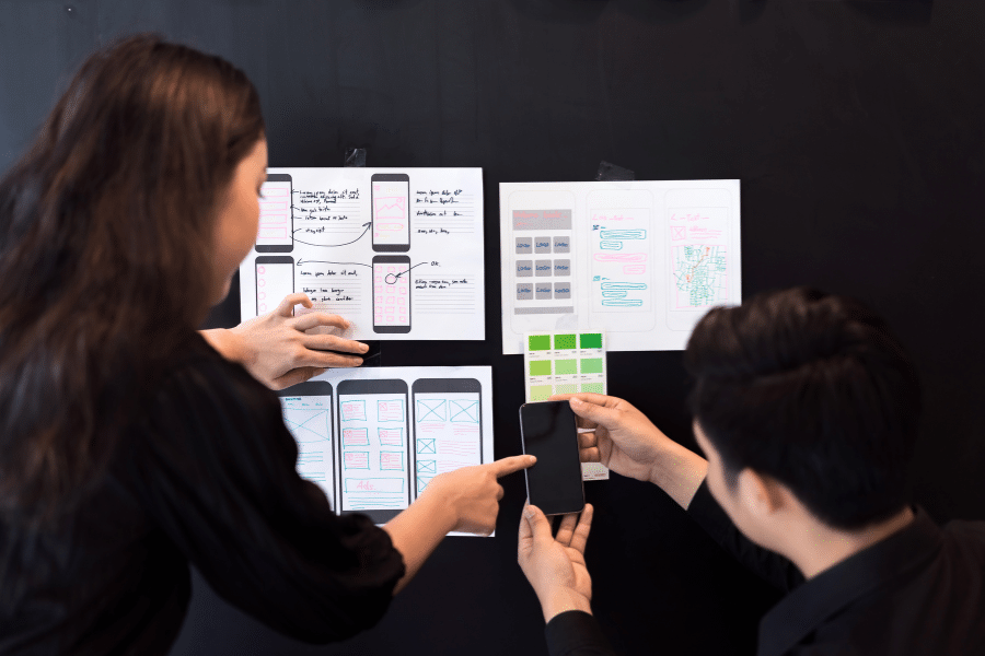
How do we do design audits at Mobivery?
Do you feel that your application is struggling to retain users effectively or isn’t receiving the expected number of downloads due to a poor user experience or inadequate interface design?
At Mobivery, we conduct a comprehensive analysis of your application and offer precise guidance to help you implement impactful enhancements.
Steps to Conduct a Mobile Application Design Audit
Study the audience for which the app is intended
Our initial step will involve conducting a comprehensive analysis of your target audience. In order to gain a deep understanding of your application’s users, it is essential to understand your business model. This involves identifying who makes up your most relevant audience, how we can effectively reach them, and what other similar applications are present in the market.
Depending on the user profile your application is targeting, it’s crucial to adapt to their level of tech-savviness, usage context, approximate age, and other relevant factors. These elements play a crucial role in shaping the user experience and interface design.
For example, creating an app for leisure use is quite different from designing one for use in an industrial work setting. The latter will need to be a very straightforward tool, easy to use with few steps, featuring large text and buttons to allow for error-free manipulation while working.
Likewise, there’s a significant difference between designing for a tech-savvy, young audience and adults who don’t frequently use apps in their daily routines. Young individuals often lean towards vibrant colors, intricate user flows, and the integration of distinctive gestures that deviate from the conventional. On the other hand, adults tend to prefer gentle color palettes, straightforward designs, and exceptionally simple user flows, where each action feels intuitive and easily accessible.
Search app references
After completing the analysis of the target audience for the application in question, as previously mentioned, we will proceed to research existing applications in the market that offer similar features. This step becomes significant as it is invaluable to have references regarding what is succeeding and attracting users, as well as what is not working. Taking note of both the positive and negative aspects of the analyzed applications is crucial to avoid repeating mistakes and establish valuable benchmarks for your design evaluation.
Analyze user reviews
It is essential to examine user reviews, both in these comparative applications and in your own, in order to understand the positive and negative aspects highlighted by each user. By examining the reviews of your own application, you can develop a more profound understanding of the deficiencies users identify and their expectations for your offerings, ultimately revealing the authentic needs they aim to satisfy.
Analyze its information architecture
After gathering these key points, we will commence a thorough analysis of the application. We will start with the architecture and its functionality itself. We will understand what the core functionality of the app is, which features are secondary, and finally, which ones are of lesser importance. Based on that, we will then determine whether your app aligns with that hierarchy. We will verify if the flows are user-friendly, if the structures are consistent, and if the views with their components are appropriate.
In certain circumstances, we create a decision flowchart to offer a visual understanding of the proposed navigation enhancements and how they would impact the overall experience.
Conducting tests with real users
We will conduct tests with multiple users to validate our observations in case we identify any dysfunctional aspects. We will implement new solutions to effectively address the problems we have identified.
Analyzing the graphic interface design
Finally, we will also evaluate whether your application features a modern and visually appealing interface design, and, most importantly, if it aligns with your user profile, as previously discussed.
Additionally, we will conduct an analysis of your application’s compliance with the necessary accessibility standards. This involves verifying that sizes, colors, and contrasts are optimally configured in accordance with your audience’s preferences.
App Design Audit Report
Through the previously outlined procedures for analyzing your application, we create a comprehensive report that summarizes the conducted study, along with specific solutions and proposals to address the identified shortcomings. In this report, we provide comparative screenshots that illustrate the previous state of your application and how it would appear with our suggestions implemented.
It’s worth noting that, while less common, we also conduct a meticulous analysis of the metrics associated with audited applications. This allows us to verify and validate the identified issues.
Conclusion
If you feel that there is room for improvement in your application and you’re looking to revitalize it to increase downloads and user retention, at Mobivery, we conduct a meticulous examination of it to provide you with a comprehensive analysis and solutions aimed at captivating users.
Our analysis will encompass user feedback, information structure, business model, usability, interface design, and, if available, any collected metrics. Furthermore, we will conduct tests with real users, propose visual solutions, and document everything clearly and comprehensibly so that you can make informed decisions.
If you liked this post, you may be interested in this other one on Conceptualization and Definition of Apps: The key to success in Mobile Application Development or this one on Fitts’ Law applied in UX


