


The eternal battle: Android vs iOS
In this post we will analyze the differences found between Android vs iOS in a few known applications. We already talked in this post the differences between their operating systems.
It is interesting to see how the components used in their designs make small differences between them. Other times, these differences are made on purpose or because they are performing an A/B Testing on some platform. The A/B Test consists in developing and launching two versions of the same functionality and measuring which one works best. Let’s start the fight by analyzing LinkedIn, Instagram and Facebook!.
Android vs iOS: LinkedIn UX/UI
Main feed:
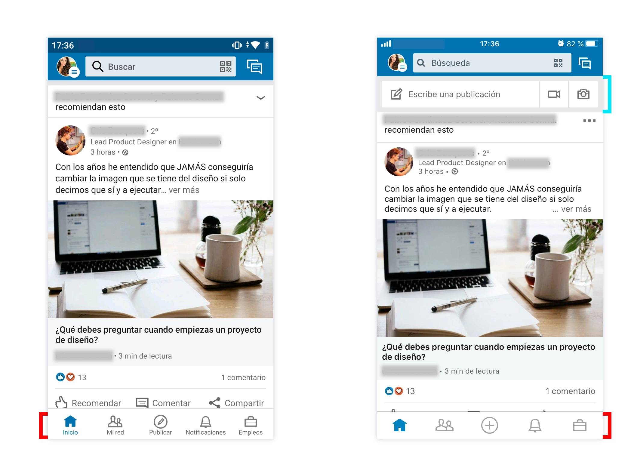
- Tabbar native vs custom:
On Android (left) is used a native tabbar, each tab has its icon + its label. The style guides of both platforms recommend that each icon should have its label to improve the user experience. This way it is easier and more intuitive to recognize the different sections. In iOS they have a custom tabbar, there is no labels on it. Maybe it looks cleaner and minimal but worse in user experience.
- Quick access to write a publication:
In iOS (right) we clearly see how they have highlighted the functionality of Publish. In addition to finding this section in the tabbar (with the “+” icon), we have under the navigation bar the access to write, upload a video or photo. It disappears when scrolling so it does not occupy space while we navigate.
Android vs iOS: 1-1. Tie!. Android earns a point for using a native tabbar with a better user experience and iOS earns another point for the quick access to write a publication.
Message filtering:

- Segmented bar vs action sheet:
In this case we can see how they have used different components. Android uses a segmented bar and iOS uses a slightly customized action sheet (rounded corners and shorter buttons).
Android vs iOS: 1-1. Tie! Each platform uses a different component, each one has advantages and disadvantages. In Android the user has to scroll horizontally in the segmented bar to see all the filters and in iOS user has to tap on the filters icon, choose one of them and if he/she wants to return and see all the messages again he/she has to click on the “X” to disable the filtering. Scroll vs 3 taps. What do you prefer?
My network:

- Manage my network with a quick access (the most important content) vs cell that access to another screen with all the content:
In Android we can see that they have taken the most important contents from the Manage my network section (Contacts, Near you and Add new contact) and have positioned it at the top of the screen, more visible. In iOS we see a cell where takes us to another screen with all the options. However, in iOS we also have a quick access of Add contact on a floating button.
Android vs iOS: 1-2. Android wins a point for a better user experience, because we have the relevant content just to a single tap. However, iOS gets two points for cleaning/minimalism header and for placing the most relevant action (Add contact) in a quick access (floating button). The iOS screen looks cleaner because it has fewer elements.
Publications detail:

- Tabbar on push views:
In iOS it is possible to keep the tabbar on the push screens. Developers can disable it but actually it is something that improves the user experience; having the tabbar we can access to the rest of the sections without going back to find the menu. In Android it is not possible to keep it natively.
Android vs iOS: 0-1. Point to iOS for better user experience!.
TOTAL: 3-5. iOS wins the fight of LinkedIn UX/UI with 3 more points!
Android vs iOS: Instagram UX/UI
Feed principal:
![]()
- logo on the left vs logo centered:
Natively, Android has the title (or logo on the main screen) aligned to the left in the navigation bar. On the opposite, iOS has centered the title or logo except in large-bars (from iOS 11).
Android vs iOS: 1-1. Tie between platforms!. In my opinion, both solutions are correct. While in Android we see two groups of elements at both sides which gives it a balanced look, in iOS, the logo is in the middle with one and two buttons on its sides, which allow us separating the title from the actions.
Settings menu:

- Side menu vs bottom sheet:
On Android we still find sometimes the side menu. iOS rarely uses it, in this case it displays the Settings menu with a customized bottom sheet.
Android vs iOS: 1-1. Both use correct solutions to display a menu by pressing a button. Like I am an iPhone user, I would give the point to iOS because I find the side menu kind of oldfashioned. I no longer see side menus in native applications from the iPhone and maybe that’s why comes that feeling. In Android we see less and less that kind of menu but it is a native component within the style guides. So in this case… tie again!.
Publication options:

- Menu vs action sheet:
In addition to having a different order of a publication’s options, Android uses a simple menu and iOS a native action sheet.
Android vs iOS: 0-1. Actually they are components that user has to perform the same number of taps but iOS wins the point for two slight improvements that the action sheet gives: we see more clearly the negative position of the Report action and we find more Intuitive the Cancel button (in Android we leave the menu by pressing outside the box).
Search:

- Search as push screen vs modal view:
The search navigation is different on both platforms. On iOS, the native search bar has the Cancel button on the right (modal view). In addition, when we start writing, the clear “x” button appears to erase what we have entered. In Android we find it natively with a back button. - Filters with icons vs labels:
A difference that we can see clearly, and it is only for an esthetic reasons is that in Android the filters are shown with icons and in iOS with labels. The icons used are quite descriptive, so user will surely not have problems to differentiate the sections.
Android vs iOS: 2-2. About the first observation, both platforms get a point because user does not notice any difference between modal view vs push view. User performs the same taps and has the same facilities to exit or delete the content entered. About the filtering, Android get a point for cleaning/minimalism and iOS another one for UX (easier and more intuition in showing the sections). Tie again!
TOTAL: 4-5. iOS wins the fight of Instagram UX/UI with only 1 more point!
Android vs iOS: Facebook UX/UI
Feed principal:
![]()
- Tabbar with 5 sections vs 6:
The tab bar differs by default—possibly due to A/B testing. It can be customized (though somewhat hidden) via Settings > Settings and privacy > Configuration > Shortcuts bar. The menus aren’t native: there’s a line above Home, and icons lack labels. On Android, Notifications is second and the Market tab appears by default, while iOS shows Notifications near the end and Groups by default. Only iOS includes the Profile tab—resulting in 5 tabs on Android and 6 on iOS. However, iOS recommends 2–5 tabs and Android 3–5, with both suggesting a “More” tab to avoid exceeding five.
Android vs iOS: 2-0. This time Android wins by not skipping the recommendation to use a maximum of 5 tabs in the tabbar. I also find more interesting the order of the sections on Android, especially for finding the Notifications section in second place.
Watch section

- List of videos saved on a cell vs on a card:
Android opts for a cell while iOS shows it on a card. The content is exactly the same and the designs of both are consistent with their feed of videos.
Android vs iOS: 1-1. Both components are appropriate to its UI used, both show the same content and both encourage them to be clicked in the same way. Tie!.
My profile menu:

- To be able to search content vs find it yourself:
In iOS it is possible to get the search bar by taping the icon. Android does not have it.
Android vs iOS: 0-1. Point to iOS for offering a search bar in this section!
Create publication in Android vs iOS

- Push view vs modal view:
Again, we see how in Android we have a push screen and in iOS a modal. - Multicolored vs monochrome icons:
Another difference about UI that we find in Facebook between platforms are these icons, we see how in Android they use several colors per icon and in iOS it is monochrome.
Android vs iOS: 2-1. In iOS there is only one difference for the user’s eye between a modal and a push and it is the way in which this screen appears. The modal comes from below and the push normally from the right and does not affect about the user experience. On Android, actually the modals and pushes do not exist (talking about programming), developers launch the screens and show the back or close button as designer decides. In this case there is also no difference in user experience, so both earn a point. About the icons, in my opinion Android wins, they have a cooler look. Years ago the trend was a flat and simple design but nowadays designs are slightly more elaborate and more colorful and richer.
TOTAL: 5-3. Android wins the fight of Facebook UX/UI with 2 more points!
Let’s count !:
- LinkedIn: 3-5
- Instagram: 4-5
- Facebook: 5-3
Who won the fight Android vs. iOS?
12-13: iOS wins with just one more point in the fight of UX/UI!
Conclusion
What do you think of the fight? As we can see, always the user experience wins over a beautiful interface. User appreciates more an intuitive and easy app than a beautiful but complicated app. As always, the ideal is find the balance between usable, intuitive and attractive design.
If you want to know more about user experience and interface design, I invite you to read this post about UX / UI.
Thank you!