The importance of accessibility
UX designers have the responsibility to design in order to users have a good experience while using our product. It means that we should analyze and consider their tastes, their needs, the context they will use the application, and also if there is something that can limit the access to our app, for instance their physical, visual, cognitive conditions. For this reason, today we are going to talk about accessibility accessibility app.
Did you know that 8 % of men and 0.5 % of women are colorblind? This is almost a 10 % of colorblind users. If we add other types of disabilities such as vision, hearing or mobility related problems, we get a total of 25 % of the population. That is a high percentage! In addition, it is not only limited to these users, it extends to any person who experience any temporary or situational disability, for example, having an injured arm (temporary) or holding a baby (situational). In these cases, user can complete tasks with one single hand.
So, as a designer we should keep this in mind so our product would be accepted by more users, but also as a human it is important to generate empathy and design for them too so these people can perform the same tasks with their conditions.
This post is focuses on specific guidelines for designers that help to build an accessibility app.
What is accessibility?
Accessibility is the design of products for people with disabilities, “quality of being easily accessible”. In the context of mobile app it means that it can be used by users with different disabilities. To get an accessible app, it must be consider that it is a team effort. Each partner has a role to play to incorporate the best accessibility practices in their process.
Let’s see 20 tips to keep in mind while designing an accessible app.
All these points have been collected and selected from the Web Content Accessibility Guidelines (WCAG):
1. Contrast between background and text
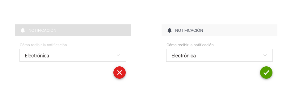
The WCAG recommends that background and text should have a minimum contrast of 3.5 to 1. In this way, we help people with visual disabilities, including color blindness and cognitive disabilities to see the content of our application. In addition, we make it more visible on older devices (poor color support) and in poorly lit environments.
Regardless of the color palette we use, if we apply this contrast rule, we make sure that, for example, a colorblind can read the text even if it is used one of its conflicting colors. Let’s look at the following example to get an idea of how colors would look with little contrast between them:

With this free tool online you can check the contrast of the colors of your design.
2. Readable texts
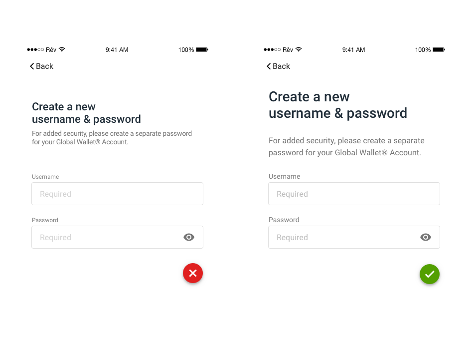
To facilitate the reading to users with sight or dyslexia problems, it is essential that copy fulfills the following requirements:
– Typography with large sizes, between 14 and 18.
– Line spacing should be at least 1.5 times the text size.
– Space between letters (tracking) at least 0.12 times the font size.
– Word spacing at least 0.16 times the text size.
– Use of simple fonts, without ornaments. It is recommended to use the native system fonts (Roboto for Android and San Francisco for iOS). They are specifically adapted for good readability in devices.
3. Indicate important copy with other graphic resources besides color
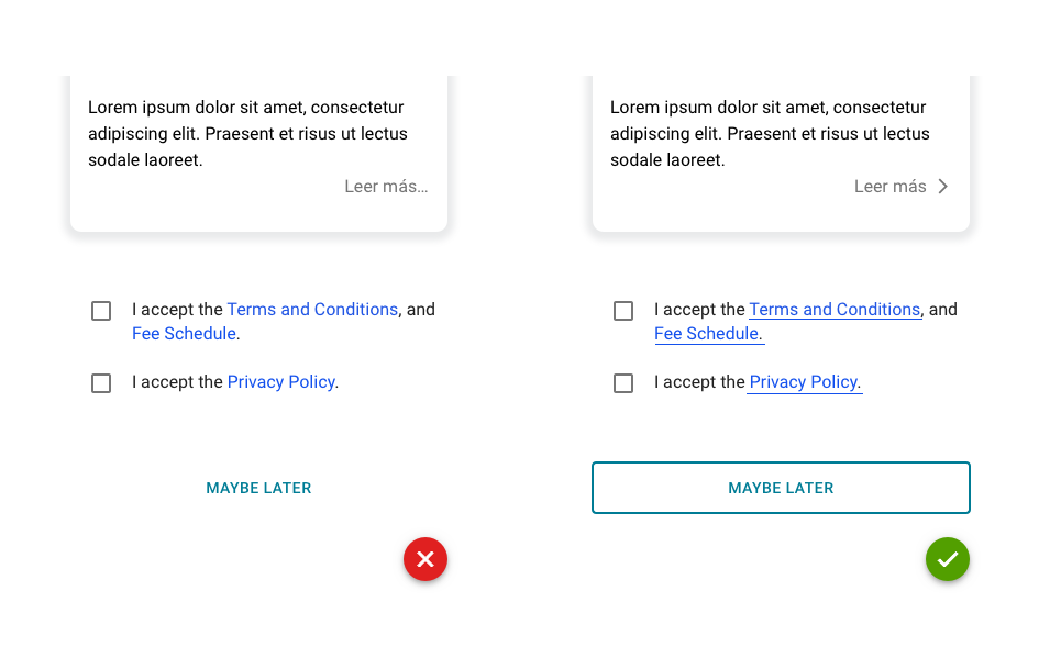
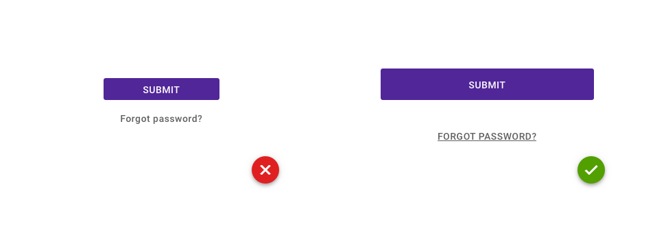
Like people with color blindness or other visual impairments cannot perceive certain colors, if important information such as hyperlinks or buttons are not indicated with any other visual resource than with color, they could not perceive that this text is clickable. Therefore it is recommended to add other indicators, for example:
– Clickable texts with icons.
– Links with underlined text.
– Buttons with boxes.
4. Text fields always labeled
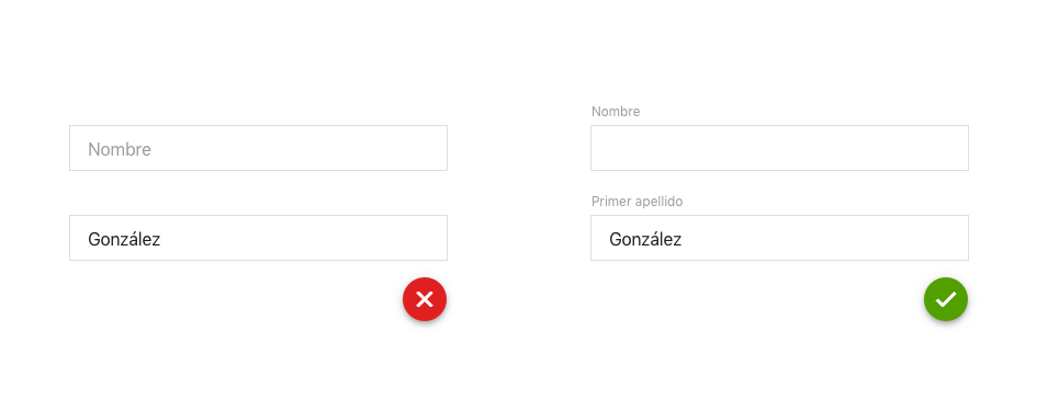
All fields on a form must show their labels, whether empty or complete. Many times we see fields with their label as placeholder and, once the information is entered, it disappears. Labels help all users to understand what is requested and are essential for those who cannot easily determine this by looking at the form or the surrounding content.
5. Placeholders to clarify information
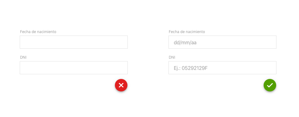
If a text field is not very clear, use placeholders to provide additional information or show examples.
6. Help texts for a better understanding
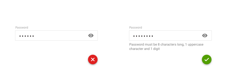
It helps all users to get instructions on how achieve the tasks. You should include these helpers in those fields that are complicated. This happens very often when we ask user to create a password fulfilling some specific requirements to be validated correctly.
7. Buttons large enough to be clearly visible and easy to tap
These requirements are really useful for those users with motor disorders and visual problems:
– The buttons must at least 44 pixels high and wide.
– They must have an inactive area around them to avoid accidental selection.
– Actions should be carried out only when the finger is lifted off the screen.
– Differentiate well the actionable content of the static.
8. Double confirmation when the user wants to achieve an important task
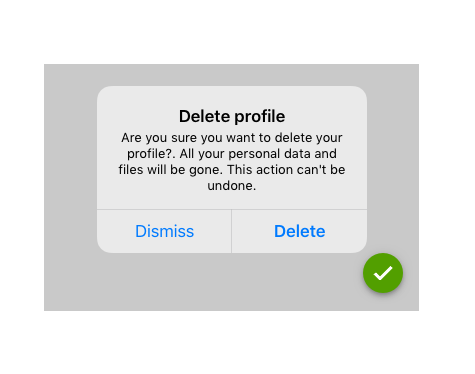
When user performs an important task with high impact (for example, buying an item or deleting the profile) we will confirm with an alert if he/she is sure to do it. Thus, if user has accidentally pressed the button, he has the chance to undo the action.
9. Consistency in layout
Consistency between screens helps users to manage their expectations while interacting with the application. It makes easier to predict where they can find things on each page. Actually, this point benefits everyone, especially when people perform multiple tasks, are distracted or simply tired at the end of the day.
Components with the same functionality should always work and be identified in the same to not create confusion. Also make sure that all the colors chosen are homogeneous and the typography too. The complex multilevel interface can be a big problem for people with disabilities, especially for those with vision disorders, cognitive and intellectual limitations. That is why it is important to keep a simple and consistent design.
For example, if we have a toolbar, we will ensure that it always appears in the same area of the screen.
10. Present the most relevant information first
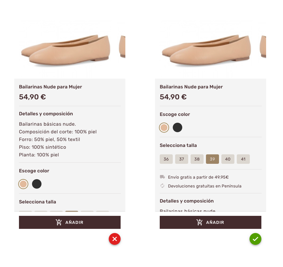
It is essential to show the important information first (at first sight without scrolling). It allows user to access to the priority content with minimal interaction.
An important tip, not just for accessibility, but also for usability, is that user has to achieve the task with minimum steps possible. Otherwise, user may feel disoriented and slowed in their tasks.
11. Simple and clear copy
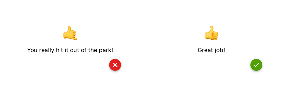
To prevent users from feeling confused or do not understand our app, it is recommended to use a simple language. This is applicable in any copy that appears like buttons, notifications, error messages, instructions, etc. It is important to not use jargon or technicalities.In this previous post you can see some more info about how to define an effective copy for our app.It is also recommended that the entire application be conveniently located to show user its specific language.
12. Use of headlines to organize the content
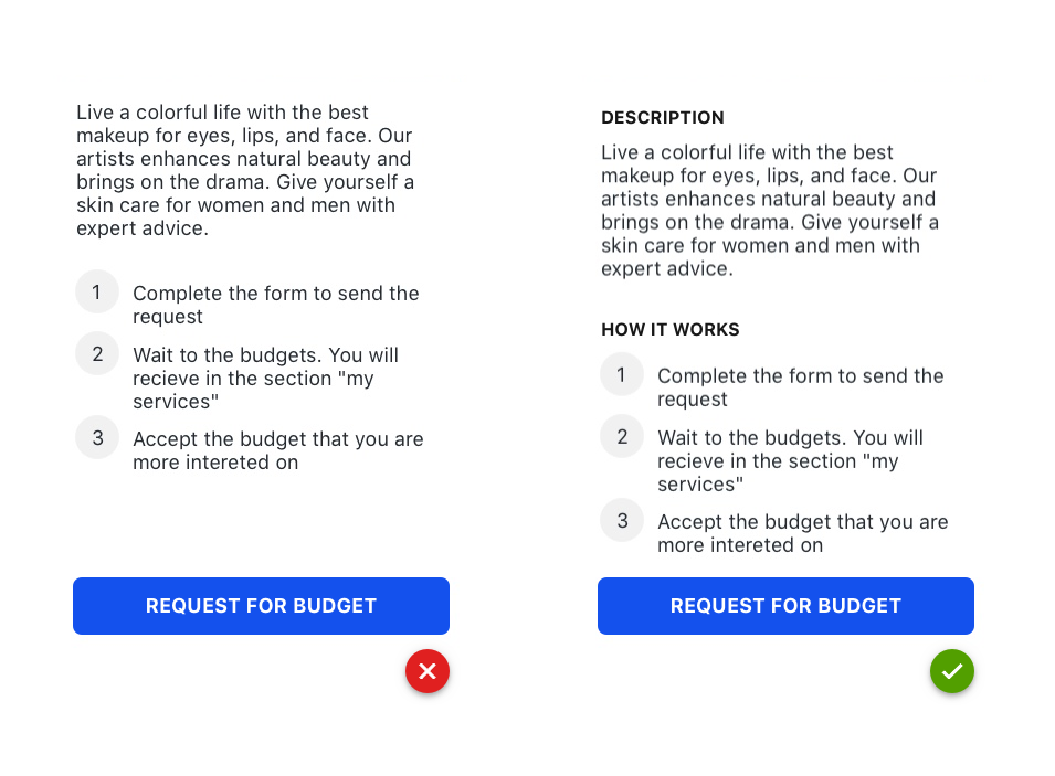
Not only to make the application accessible, but also to improve the experience of all users, presenting the content with headers or titles helps to understand the structure of the information and locate user where he/she is at that precise moment.
This block contains unexpected or invalid content.
13. Explain the errors clearly and how to fix the problem
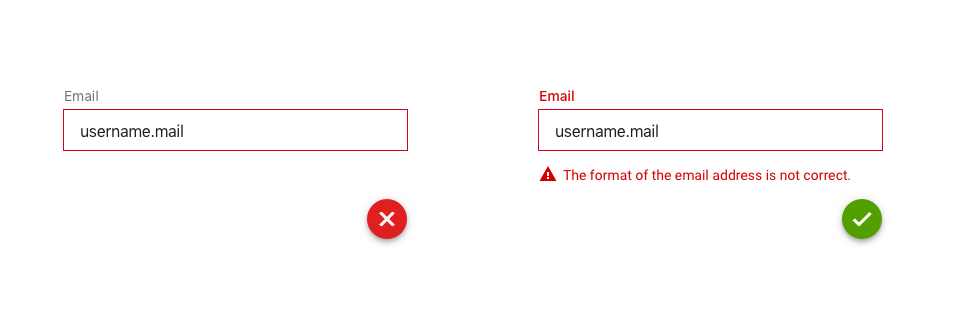
Error messages are clearer if they appear in the field itself (inline). Indicate the field in red and explain exactly what happened and how to fix it. It should never be indicated only with color, use also text and even reinforced it with an icon that indicates alert. In this way, we help users with visual disabilities who cannot appreciate colors to easily recognize where the error is and how to solve it.
14. Always readable texts
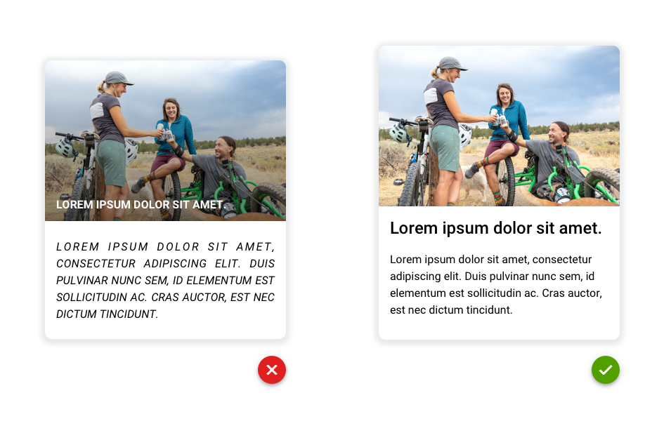
– Avoid using uppercase or italics in long texts. They are more difficult to read and therefore it could be a tedious task for anyone, not just for disable people. You could use it in short texts, buttons or headlines.
– Never use lights fonts. In addition to being more difficult to understand, they can generate visual vibrations. Opt for regular, semi-bold and bold fonts.
– Avoid using backgrounds behind texts. For example images, gradients, bright colors, blurs, transparencies …
– Do not justify texts, a lot of white spaces appear between words and make it more complicated to read.
15. Simple and slow animations
The flashes or flickers in our animations could produce convulsions or epileptic fits to users sensitive to motion effects. We can avoid it by making our animations or videos with no flashes, sudden color changes or blink more than 3 times per second (as indicated by the WCAG).


16. Do not use complicated or unusual gestures
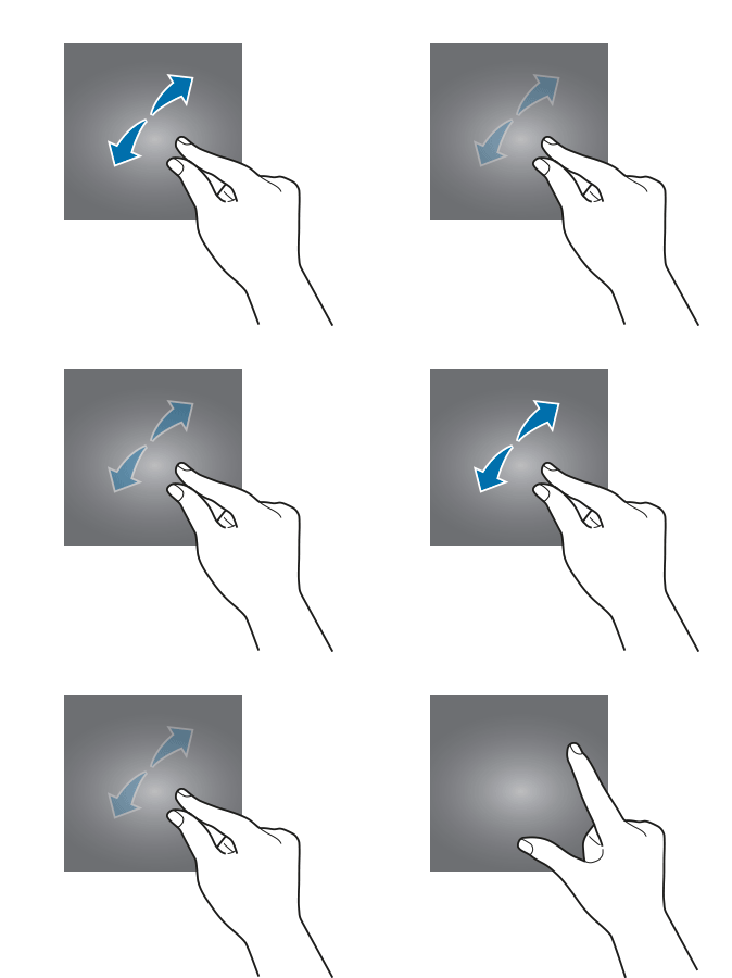
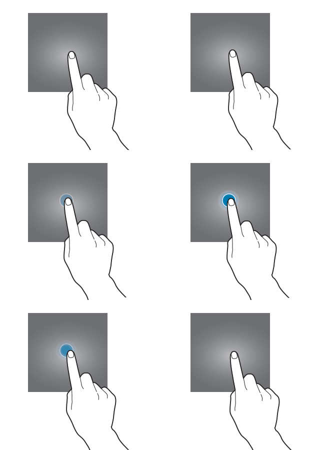
If you use complex gestures in your application such as pinch, double tap or long press, also provide another simple alternative for users with motor or learning difficulties. For example, in a map view that zooming by pinching is necessary to offer the [+] and [-] buttons to zoom in and out, and the arrow buttons to move step by step in all directions.


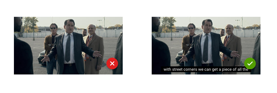
17. Always videos with subtitles
To provide the content of your app’s videos to all users, including those with audio problems, you must present captions (including nonverbal elements).
This point not only benefits people who are deaf or hard of hearing, but can also benefits anyone who is accessing the content in a noisy bar or in a silent library with the volume turned off.
Subtitles must necessarily fulfill with WCAG standards:
– Subtitles on the screen should be synchronized with the corresponding audio and video content.
– Make sure users have enough time to read it.
– Background and text comply with the previous rules mentioned in terms of color, size, contrast, etc.
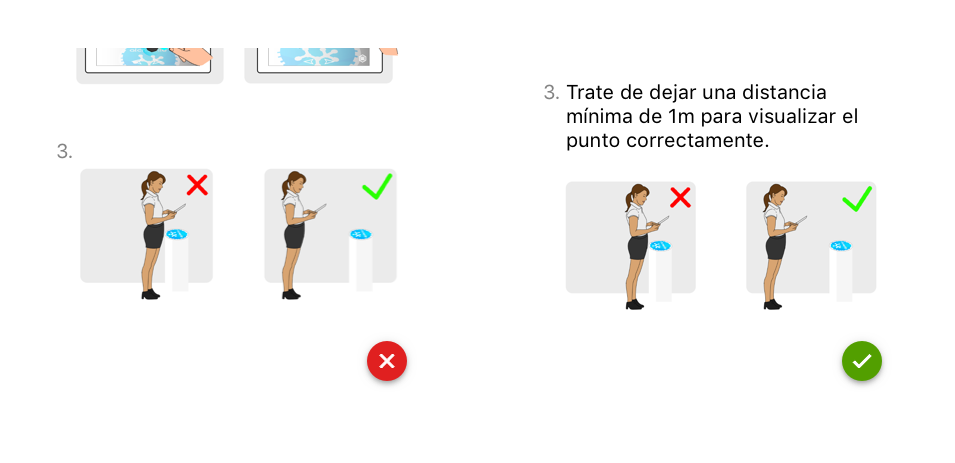
18. Do not indicate important instructions with images only
Do not indicate with only icons, videos or images important instructions to operate or understand the content. Avoid for example the typical “See the image above”. Instead, describe the content with plain text so visually impaired users can use focus tools and receive your instructions via audio. We will talk about this focus tool later.
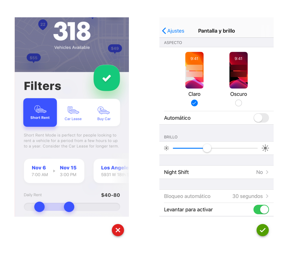
19. Use native components
Designing for an accessibility app requires that components support certain characteristics so they can work properly when users interact with accessible tools with the app (VoiceOver, zoom, focus, external keyboards…). Furthermore these native components are more familiar. If you use custom components, investigate how to incorporate integrated accessibility.
20. Adapt the content of the app for the focus system
Source WCAG, Source WCAG, Source WCAG
The focus system is a virtual tool that we can assimilate as a pointer to a graphic component. Indicates which screen element is focused and reads its content. Thanks to this, users can receive the information of the element through the properties of the accessibility layer or interact with it.
Users move this focus by pressing on the touch screen or by scrolling and then clicking with an external device. The navigation style is sequential, the focus is jumping from element to element until the one you want to activate is reached. For this reason, we should work together with the developer to activate this function in the accessibility layer. In addition to this, it is important to prepare the components used in our design so the focus can act efficiently and coherently. We should consider the following:
– Only should receive the focus those elements that are essential to fully understand the information shown in the view . Avoid focusing on decorative elements.
– It is very important the order that we plan the focus going through the elements of our design. The focus does not consider the visual arrangement, but it does the order in which the elements were incorporated into it (the tool allows us to determine the order in which the elements will be focused).
– Name and label each component correctly. Focus tagging is a property present in all existing accessibility layers. It allows to define the text that focus will dictate when it is placed in the element. It is used to provide a textual alternative to graphic elements, such as images or buttons. In the case of buttons, the label must not visually describe the element it represents, just the action associated with that element. For example, if we have a button to send an email and it is represented by an envelope, the name should be “send” and in no case “envelope”.
– Group related controls to save time and make it easier for the user to read and understand the content.
I leave a video where we can see how users use this focus tool:
Conclusion about an accessibility app
As more happy users we get, better ratings and more downloads we will obtain. Not only that, but we will help disabled people to access information equally, regardless of their capacity. With your help they could also book flights, shop online, chat with other people, find employment, etc.
We are sure you you like also this post with essential tools for a UX/UI designer.
Thank you very much!


