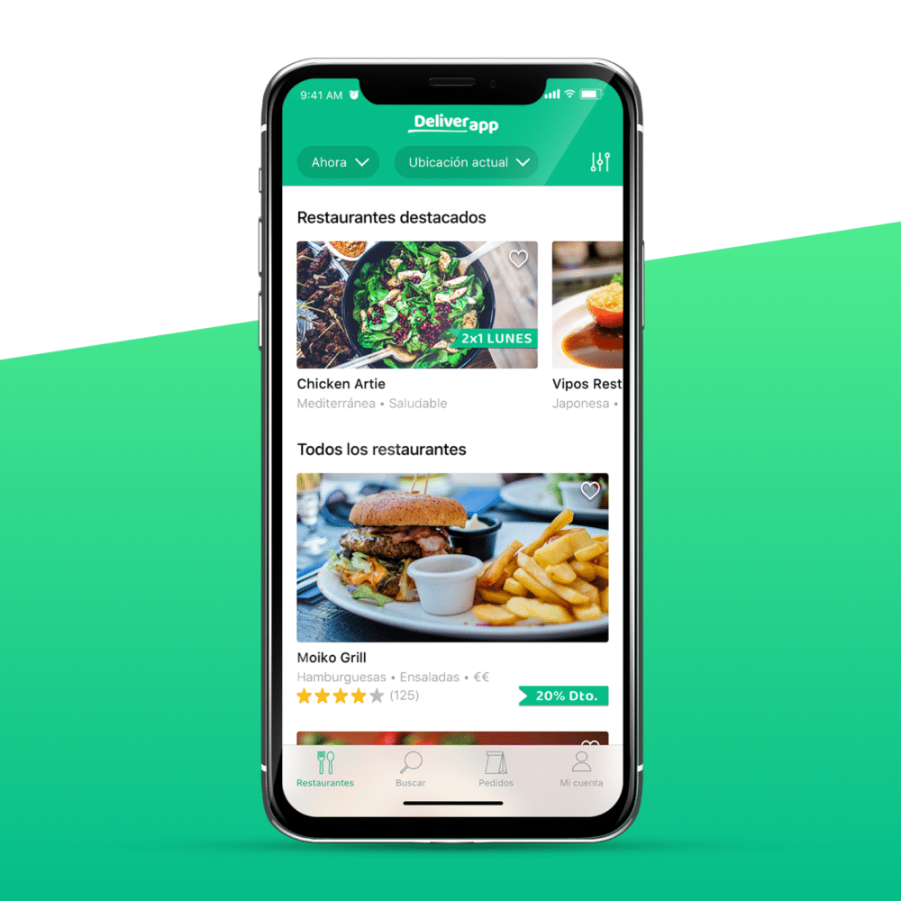
Hi again! In the previous post (part 1) we analyzed 5 delivery apps and now, we are going to see how to design a better food delivery app including its navigation map (UX). We already saw the points in common, the coolest things from each one and also, we are going to apply the UX tricks that we talked about in this post.
Let’s mention again these common points from all of them and the conclusions we got to not forget any detail:
What delivery apps have in common?
- They all have a list of restaurants, search field, profile and where / when selector to my order.
- All of them have a section of my cart that allows you to see your orders with the possibility of adding more dishes or remove them.
- In the restaurant lists, we always find the name, type of food, price range and some of them the address, distance, minimum order and deals.
- They use bright colors. Blue, green and red predominate.
- In the headers they all show an image of their food.
- The categories of the menu are highlighted with headlines and all (except Glovo) do not have images of each of the dishes they offer, only the text description. This would force clients to take professional pictures of every dish.
- Quality images (photographer) used in lists and headers.
- They all use sans-sherif fonts in their logos and the system type for the app (views).
Conclusions from the study to put into practice in our food delivery app design
✔The delivery apps with the best user experience are the ones that use tabbar like Uber Eats and Just Eat. In this way you have the list of contents in a tab, my orders in another and profile in a different one. The navigation would be simpler and more linear than in a Side menu (you have to go back to change section).
✔Of course, it is necessary a content filtering for restaurants.
✔The applications that most appeal visually are those that use white backgrounds and large professional images such as Deliveroo, Just Eat and Uber Eats.
✔Simple icons accompanying the labels reinforce the content and help the user. The type of client is quite varied (according to the restaurant, we would say 18-45 years old).
✔Being able to add a note, make a restaurant favourite from the list and autocomplete + search suggestions improve the UX.
✔It is quite attractive and useful the function of tracking your order in real time as in Uber Eats.
✔Something that breaks a bit the monotony of the lists, are the horizontal scrolls (for example with the featured restaurants).
✔The restaurants with discounts in the list stand out from the rest of the restaurants.
Let’s design the food delivery app structure!
With all these points we have designed the structure of the delivery app, we have defined its navigability applying the tricks for a better user experience and also, at the end of the post we are going to see the cool interface that we have designed to make it attractive.
In fact, just as we were able to make the app to offer home food delivery service from many restaurants (level 2, eg Deliveroo), it is also possible to scale it up for a single restaurant menu (level 3, eg Telepizza), and even for level 1, all types of delivery app services, (eg Glovo).
In this post, we will only focus on Level 2 (food delivery service from many associated restaurants). First, we will see its functionality showing parts of its flow map (if you need to see the map completely do not hesitate to contact us). And then we’ll see the UI applied on a few model screens.
Before starting, we should comment that it has been decided to make the design of the food delivery app for an iOS application. If it would be for iOS and Android, it would be recommended to make the wireframes in a way that both development teams could read the flow easily (more generic elements).
Flow map (UX) of the app:
It is important to show the navigation of the app in order, like opened for the first time, to show all the options, errors and processes that a user could find.
1- First we will comment how the content of the app is structured. We will use tabbar with 4 tabs:
- Home
- Search
- My orders
- Account
✔We already saw that apps with better UX in food delivery app design the ones that use tabbar (like Uber Eats and Just Eat) because the navigation would be simpler and more linear than side menu (you have to go backwards to change the section).
2- The first screen when the app is opening and loading content is the splash. We only show the logo but you can also design a food delivery app splash screen with an animation or a welcome text for example. Keep in mind that both examples are not native and it would cost more because of difficulty in development. Also, if the application has a multilingual function, it must be translated to each language.
3- Next, we have decided to introduce a tutorial (optional) to help user and also ask for the allow location (to show content available near him/her). If the allow location is denied, we give the option to introduce the destiny manually.
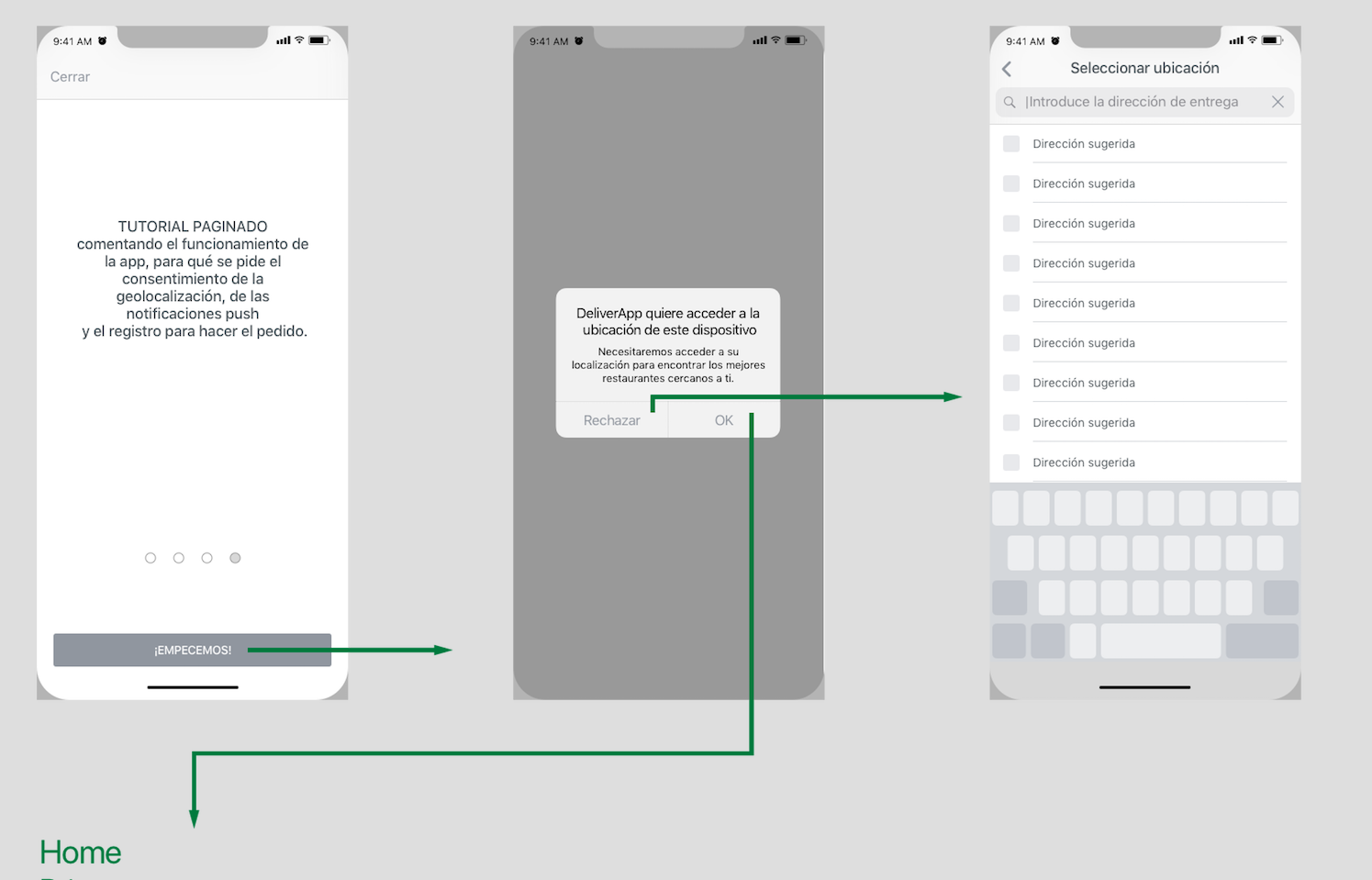
4- In this way, we immediately show the content (list of restaurants) with two filters by default: “When” = now and “Where” = place indicated (either the geolocation or the address entered manually). These selectors are editable.
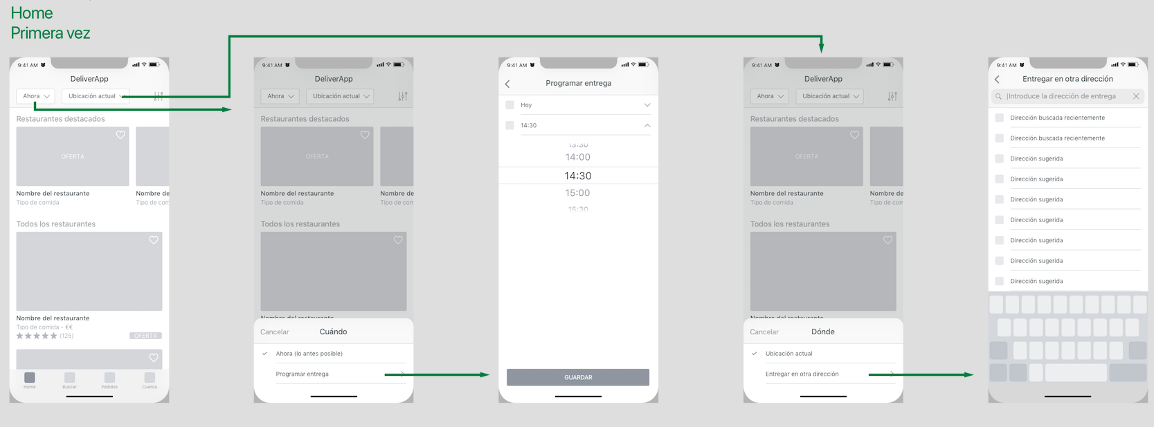
✔We let user navigate for the app without forcing him to log in. He/she can prepare the order and when he/she wants to pay, we show the login or the necessary information. It is less intrusive, improves the user experience and we get fewer casualties because they have already made the order and they would’t like to lose all the work done and make it again in another app.
We have said that we can introduce the place by geolocation or manually and for “When”, we give the possibility of “now” or “schedule for later”. We also need a sort by to show the content in the way that user is interested, for example: by the most requested, favorite, with deals, open right now, etc.
In this list we see only the important info of each restaurant: name, picture, type of food, rating and promotions.
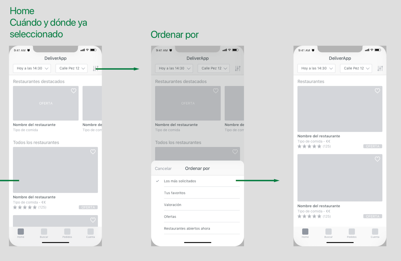
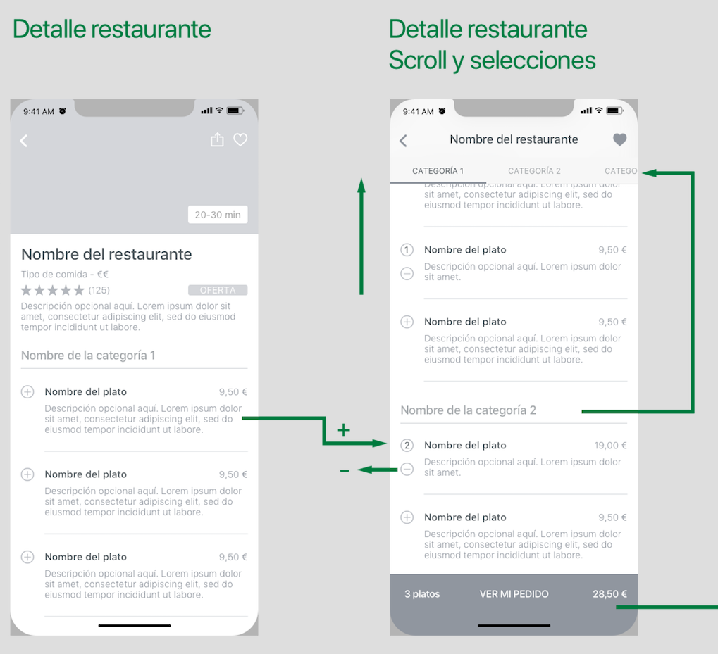
5- If we tap on one of them, we go to its detail. Here the information is completed. Below the information we find the menu of the restaurant.
To select dishes, we applied something that we liked in Glovo and Deliveroo:
✔ To be able to select dishes from the list directly, appreciate that the dish is already selected and the possibility of editing it. Each cell has an add button “+” and when you press it, the dish is selected, and a subtract button ¨-¨ appears (subtract if you have more than one and delete if you only have one).
At the bottom of the screen, we find the summary of the dishes (the amount, price and the access to orders screen). In addition, we also applied a good idea from Uber:
✔ When scrolling, the categories of the dishes are shown in the upper part (segmented screen with horizontal scroll) to make the search of the dish easier.
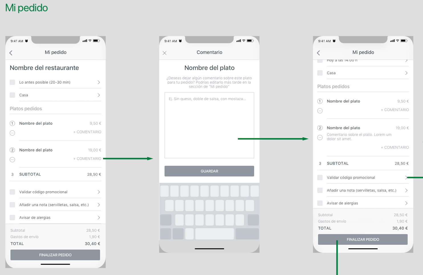
6- On “My Order” view, we remind user the name of the restaurant (because there are plenty of them in the app), we show “Where” and “When”we will get the food, the list of dishes selected and at the end all the secondary actions such as “Promotional code”, ” Add notes “,” Allergens “, etc.
At the bottom of the screen we have a sticky box with the prices of “Subtotal”, “Shipping costs” (if any), “Discount for loyalty” (if it has it), the “Total” and the access to “End order”.
These cells are almost the same than the dishes list. We just removed the description and added the “Add Comment button”. This button improves the user experience in case you want to clarify some information such as adding or removing ingredients, for example.
7- At the time of finalizing the order we see on the map the following: Is the user registered?
- Obviously, if it is the first time you open the app, no, but we show also how would be if the user used the application before and the session was already open. If you are not, it takes us to login (with the forgot password and registration).
- If you are, it takes us to “End the order” screen with the delivery address and payment method data to check them and accept if it is correct. These textfields, of course, must be editable.
✔ Adding a cell in the delivery address to put a nickname helps user to recognize them more easily. For example “home”, “work”, “Ana’s place”, etc.
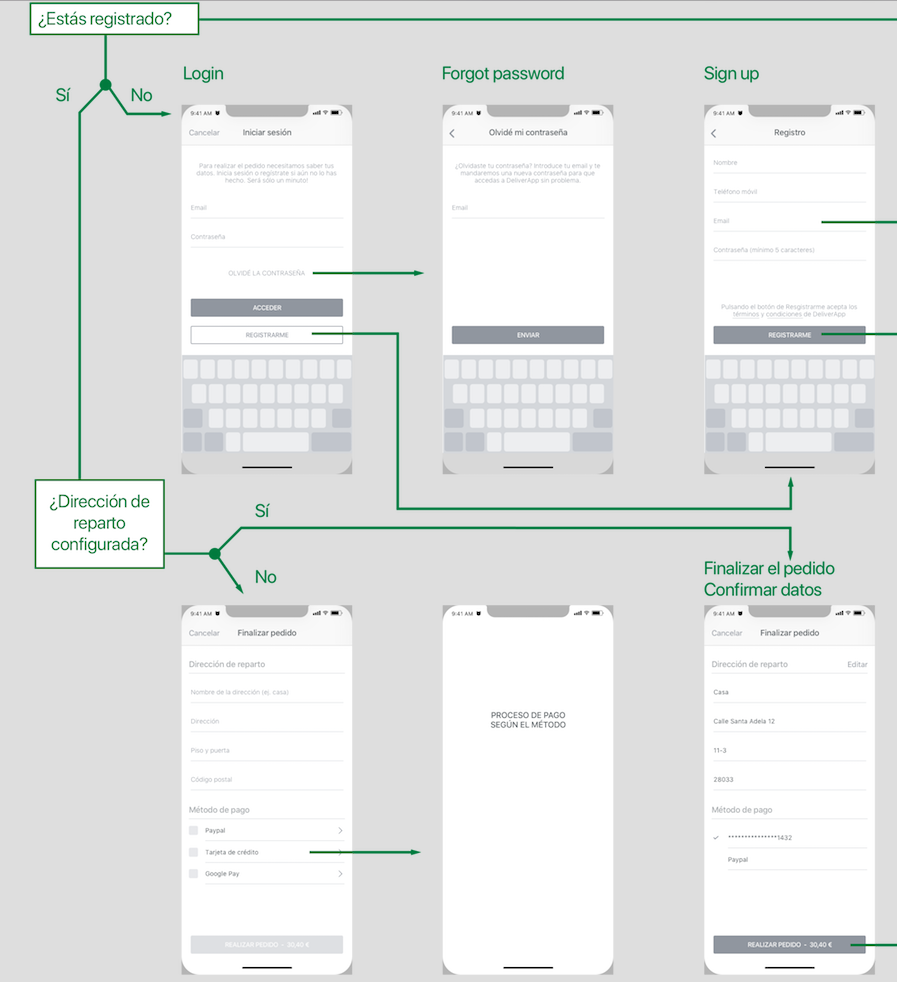
8- Time to Login and Registration. Now, once user has selected all the dishes for the order, it is when we are going to ask him to log in or register if it is the first time.
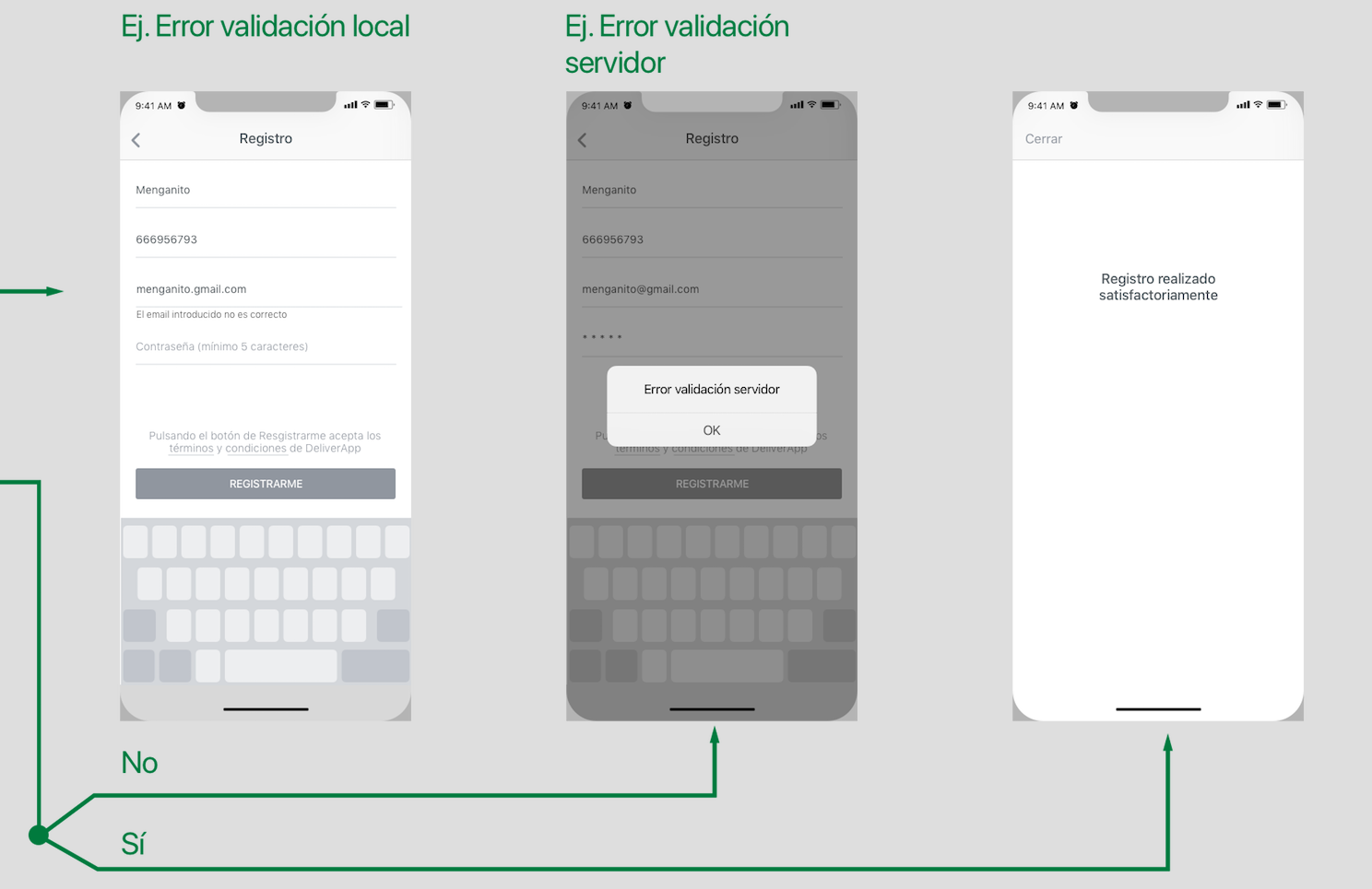
As I mentioned before, in a flow map you should show at least once a local error, for example when the user enters the email incorrectly, a server error, if for example the username or password is not correct and also a validation of a task, for example “Register successfully done”
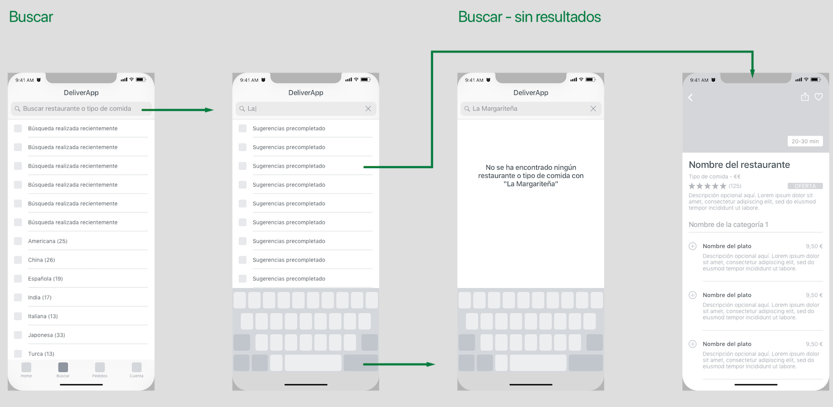
9- Search restaurants. As you can see, we also apply what we liked about Deliveroo:
✔ Search tab with autocomplete, suggestions and last searches. These improve the user experience during a search.
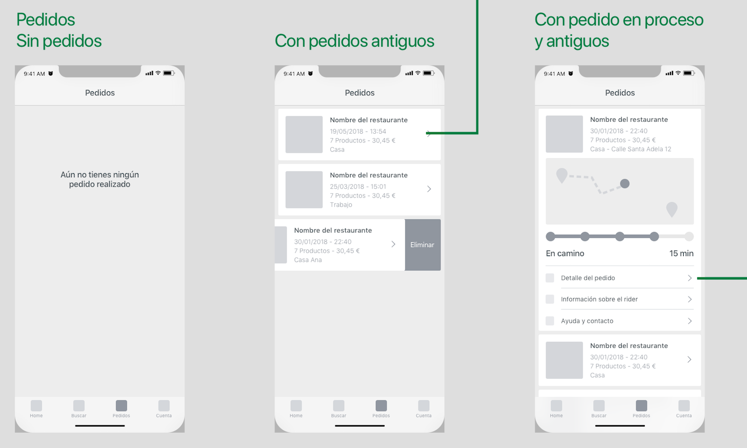
10- In My Orders tab we will show a placeholder if there is no order at all, a list with only old orders and a list of old ones and the one in progress. They are sorted from most recent (top) to oldest.
- In the old orders, we show the image of the type of food, the name of the restaurant, date and summary of the order.
- The order in progress has a real-time tracking of your order as in Uber Eats. We can see on the map the starting point (restaurant), the destination (address) and where the rider is going. Also, we see below the progress with steps and the approximate time left to receive the order. In the same card, we include a Detail of the order, Info about the rider and Help or Contact.
The details of the old order and the order in progress are exactly the same but the old one has a “Re-order again” button.
11 – And finally, the Account tab. The content of this view vary depending if user is logged in or not.
- If you are logged in, we see the welcome text personalized (with your name) and all the data you can edit to place your order such as: “Personal data”, “Favorite restaurants”, “Payment methods”, “Delivery addresses”, “Code of loyalty “, etc. Then the sections on the app: “Help” or tutorial, “Valóranos”, “Terms and conditions”, “Contact”, etc. And finally also the option “Close session.”
- If you are not logged in, the welcome text is generic, then the access to “Log in” or register and finally the common sections on the app that we have previously commented.
These sections will be grouped together to get in order the information and make it easier and more usable.
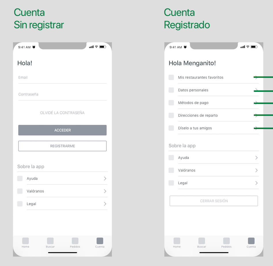
Well, once we have developed the flow map, it would be best to check that everything work correctly and we do not forget anything. To do this, it is recommendable to export all the screens and make a prototype to navigate over it and see its natural flow from a mobile.
App’s user interface
Once we check with the prototype that no functionality is missing, we continue applying the user interface.
As you can see now, we have applied the interesting UI features we found when analyzing food delivery app design in the previous post. To show the design, we normally choose model screens that show all the elements that the app contains. In this way, we save time, it is not necessary to prepare all the screens. Right now we just going to see the following:
- Splash
- List of restaurants.
- Restaurant detail.
- Detail of restaurant with scroll and some selected dishes.
- My order.
- Empty registration screen.
- Full registration screen.
I enclose the splash to show the chosen brand colors and the logo.
These are within the points in common and conclusions that we got in the previous analysis:
✔ Bright colors, blue and green predominate.
✔ Sans-sherif font for the logo.
We have used a gradient in bluish green tones and a logo with a round font. The colors we would say are between Glovo and Uber Eats.
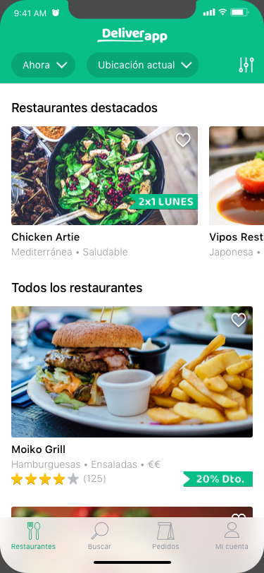
2- Restaurant list
- For the header we use the darker green from the gradient shown in the previous screen. With this green, the white text contrasts more with the rest, more readable.
- We have included the logo in the navbar and below the filters of Where and when. You will see in the whole app that buttons, cards, icons and images have quite rounded corners. We are consistent and we apply it in all the elements.
- White backgrounds, stroke icons with some details and the cards are very clean.
- We start with the featured restaurants with horizontal scroll and the rest of the restaurants with common scroll and larger.
- The info from the featured restaurants is simpler than the restaurants that come next. These last ones also have rating, price range, and the promotion goes bellow with the rest of the info.
- From Uber eats we got the idea of being able to make a favorite restaurant from the list and we applied it.
- At the top right we see the sort by button.
- The result is a quite clean screen, with good margins, cool pictures and a good hierarchy of information.
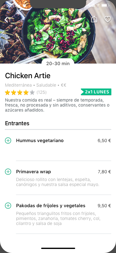
3- Restaurant detail
- If we pay attention in the header, we see that it is the same structure than the cell from the list of restaurants + description and approximate delivery time. Repeat structures is good for two reasons: the user associates better the content from where it comes and second, it is easier to develop it.
- The navbar is transparent and the icons of back, share and favorites are white but with shadows so you can see them better on top of the image.
- The promotion in this way stands out and makes it more obtrusive.
- The list of dishes is very similar to the wireframe. Only the sizes and colors of the texts and add buttons have been adjusted a bit. As you see, we find cells with no description, with two lines, with three… We show always all the possibilities.
- Hierarchy of information in the cell: First the title (large, black and thick),then the price (medium and black size) and the description (small and grey).
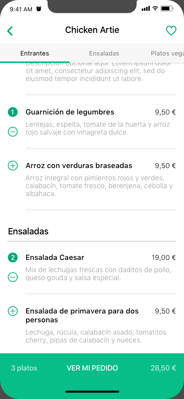
4- Restaurant list with scroll and selected dishes
This screen is the same as the previous one but doing scroll and having selected some dishes.
- The categories of the menu, once you scroll, go to the top of the screen as a segmented view (with horizontal scroll). This bar segmented is slightly darker than the navbar.
- The icons change from white to primary green color.
- As you can see, the green elements are always clickable, the back, favorites, add, subtract, see my order …
- A cell with two title lines is also shown here.
- The summary of dishes is sticky at the bottom with the amount and the price slightly transparent than “See my order”.
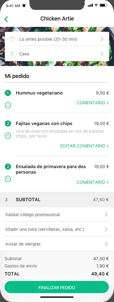
5- My order
For this screen we have actually design a few versions from the header:
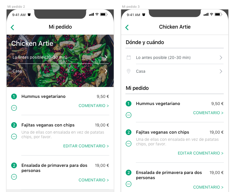
In version 1 the header is made with the image of the restaurant and the text of Name, Where and When above. The problem is that it is not very readable and even we have to use darken mask on top of the image and that makes dirtier the screen.
In the second version, the data were grouped with headlines in Where and when and Selected dishes. This view actually works very well, is clear, simple and readable, but perhaps everything is very flat and too white. For that reason we decided to put an image in the background and create the final version that we have at the left.
- Name of the restaurant on the navbar.
- Background image of the restaurant.
- When and where in a card on top of the image.
- Grouping of the selected dishes with a headline.
- Subtotal cell at the end of the list of selected dishes.
- Cells with secondary actions after the subtotal.
- Prices in sticky gray box at the bottom with a button to finalize the order.
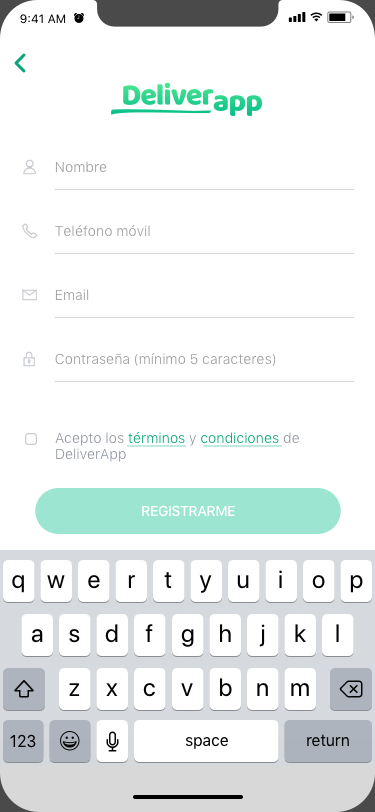
6- Empty registration screen
With these two last screens, we show how are the empty and complete cells.
- We have the logo in the header.
- We see that it is a push screen for the reason that we come from the login screen.
- The cells have light text because they are placeholders.
- We have the GDPR with an unmarked checkbox as the new law says.
- The Register button is inactive until we complete the entire form correctly and accept the terms and conditions.
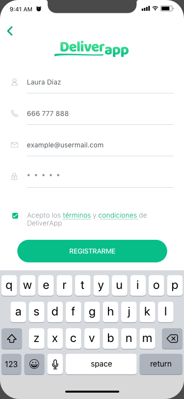
7- Complete registration screen
Here you see the complete form and the terms and condition saccepted.
- The text entered now is black.
- The icons are grey to give relevance to the input entered.
- If we decided not to put icons, in the cells we would have to enter the permanent title, so the user does not get lost on what he7she has to enter in that field. It’s another tip for a better UX.
- Terms and Conditions is underlined because it takes us to another view.
- The button is already active.
Conclusions of designing a delivery app
-
-
- In the part of UX we have shown how is the flow of the app from the first time opened until the order is successfully done. Also the examples of errors that we could find (local and server).
- This post has been a summary to show the relevant content but it is actually much more extensive. We have missed a lot of secondary functionality.
- Re-emphasize that, once the navigation of an app is done, it would be necessary to check it with the team and client and also it is recommended to export the screens and make a prototype. In this way we can check the natural flow and correct the errors before we design the UI.
- For the UI design, it is advisable to design a food delivery app by creating just the model screens that contain all the graphic elements that developers may encounter in the app. It is not necessary to design every single view that appears on this map.
- Designing the user interface of an app, it is best to be clean and use the most native elements possible to avoid complications in development. Yes, it is possible to give a touch of distinction to your app even if you use native elements as we have seen. Simplicity improves user experience, less is more!
-
If you are reading this post because you are interested in designing a delivery app or developing any other kind of project, you might be interested in . Do not hesitate to contact us!
Thank you very much and I hope you liked it!

